A Notion client portal is a page you build for one client and then share with them, where they can see the work you're doing for them: their content calendar, the posts sitting there waiting on their approval, the assets they still owe you, last month's report, and the contract they signed back in February.
You build it once in your own workspace, duplicate it for each new client, and share their copy as a guest invite, so they can open it whenever they like without ever seeing another client's anything.
That's the whole of it, and what makes it worth building is what it replaces.
Right now, if you're running socials for three or four brands, everything you know about any one of them is scattered across places that were never built to hold it. The brand colours are in a Drive folder somebody shared with you in March, the sign-off on last week's carousel is a thumbs up in a DM, and the strategy you agreed on lives in a Google Doc that's been edited so many times it no longer describes what you actually do.
None of it is lost, exactly. It's more that you've become the index, the only thing in the whole setup that knows where anything is, so every question your client has has to route through you to get answered.
Any one of those answers takes ninety seconds, which is why it never registers as the thing wrecking your week. What it actually costs you is the interruption, because each one lands while you're mid-edit on something else and you lose twenty minutes finding your way back in.
The four beats your portal has to hold
Your month runs on a loop, and it's the same four beats in the same order every time:
- You plan what's going out.
- The client approves it.
- It publishes.
- You report on how it did.
Then it starts again.
Three of those beats are where basically all of your admin comes from:
- Approvals generate the most messages by a distance.
- The month is the thing your client can't see without you narrating it.
- The report is the page that quietly decides whether they renew.
So those are the three to build properly, and the rest of the portal can be as simple as you like. Here's what goes on each page, starting with the one that happens before any content does.
Onboarding is where all the chasing actually lives
Think about the last client you signed and how long it took from "yes let's do it" to you writing the first caption.
Almost none of that was work. It was you asking for their logins, then asking again, then getting the logins but not the brand guidelines, then getting a font file with no idea which of the three fonts in it goes on headings.
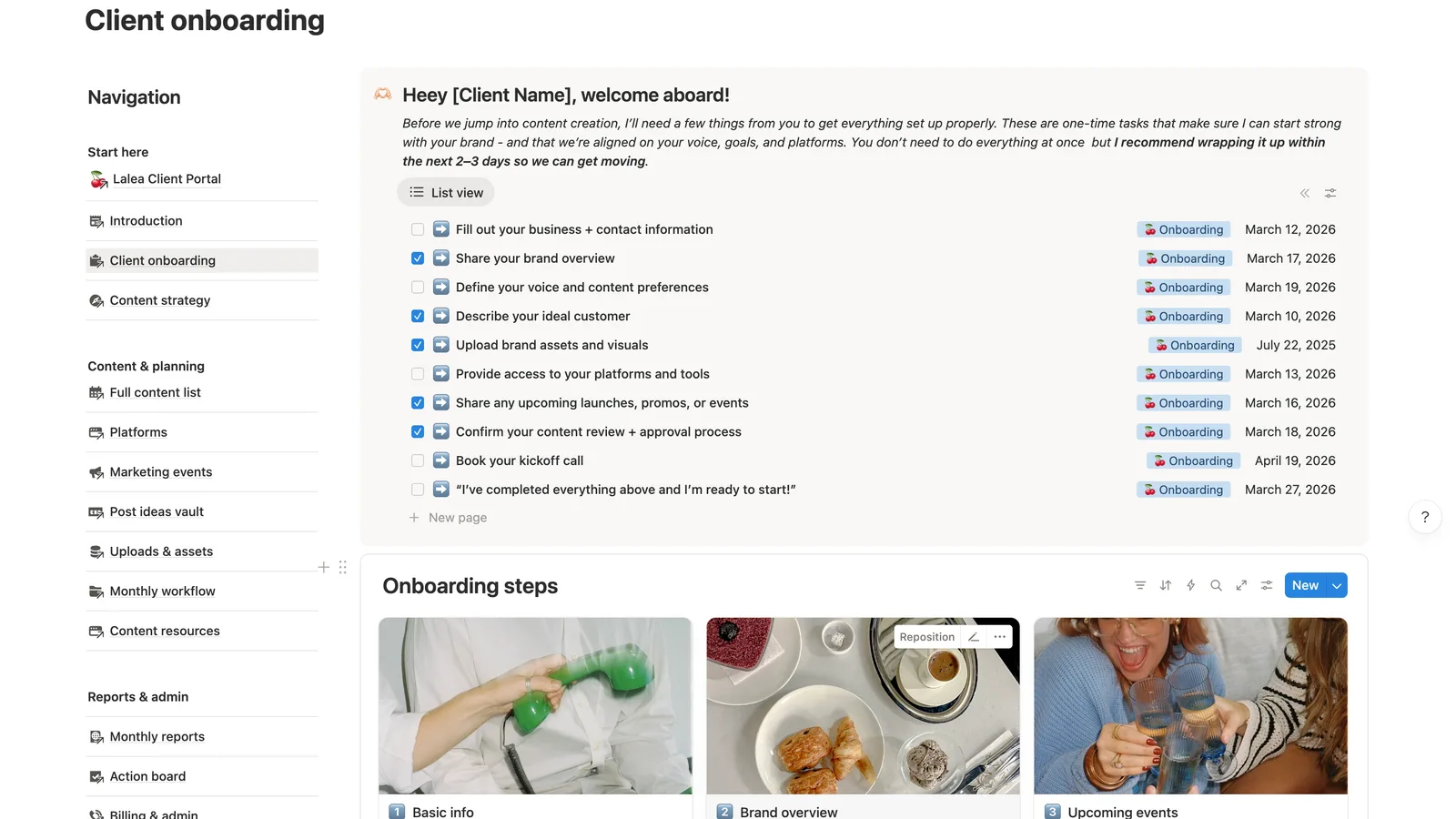
An onboarding page fixes that by flipping who's holding the list. Instead of you tracking nine outstanding items in your head, the client opens a page with those nine on it, each with a due date and each clicking through to a form they fill in themselves:
- Business and contact info
- Brand overview
- Voice and content preferences
- Ideal customer
- Brand assets and visuals
- Platform access
- Upcoming launches and events
- Confirming how approvals will work
- Booking the kickoff call
The bit that surprises people is that clients mostly do it, and do it faster, because a checklist with six things left on it reads as something they can finish this afternoon, where six separate messages spread over ten days reads as an ongoing obligation nobody enjoys.
There's a second thing you get that's harder to put a number on. The first real experience your client has of working with you stops being an apologetic message asking for logins and becomes a page that's obviously been thought about, and people decide how organised you are in about four seconds.
The approval loop is the page that earns its keep
Of everything in the portal, this is the page to get right first, because it sits directly between you and most of the messages you get in a week.
Here's the version you're probably living with. You post the drafts into a Canva link or a Drive folder, message the client to say they're ready, and then wait.
Two days later you get "love them! just one thing on the second one" and no indication of which second one, because the order in your folder isn't the order they're looking at. Somewhere in there they also approve something out loud on a call, which you now have to remember, because it exists nowhere 💀
All of that comes from the same root, which is that the feedback and the thing being fed back on live in different places and neither of them holds a status.
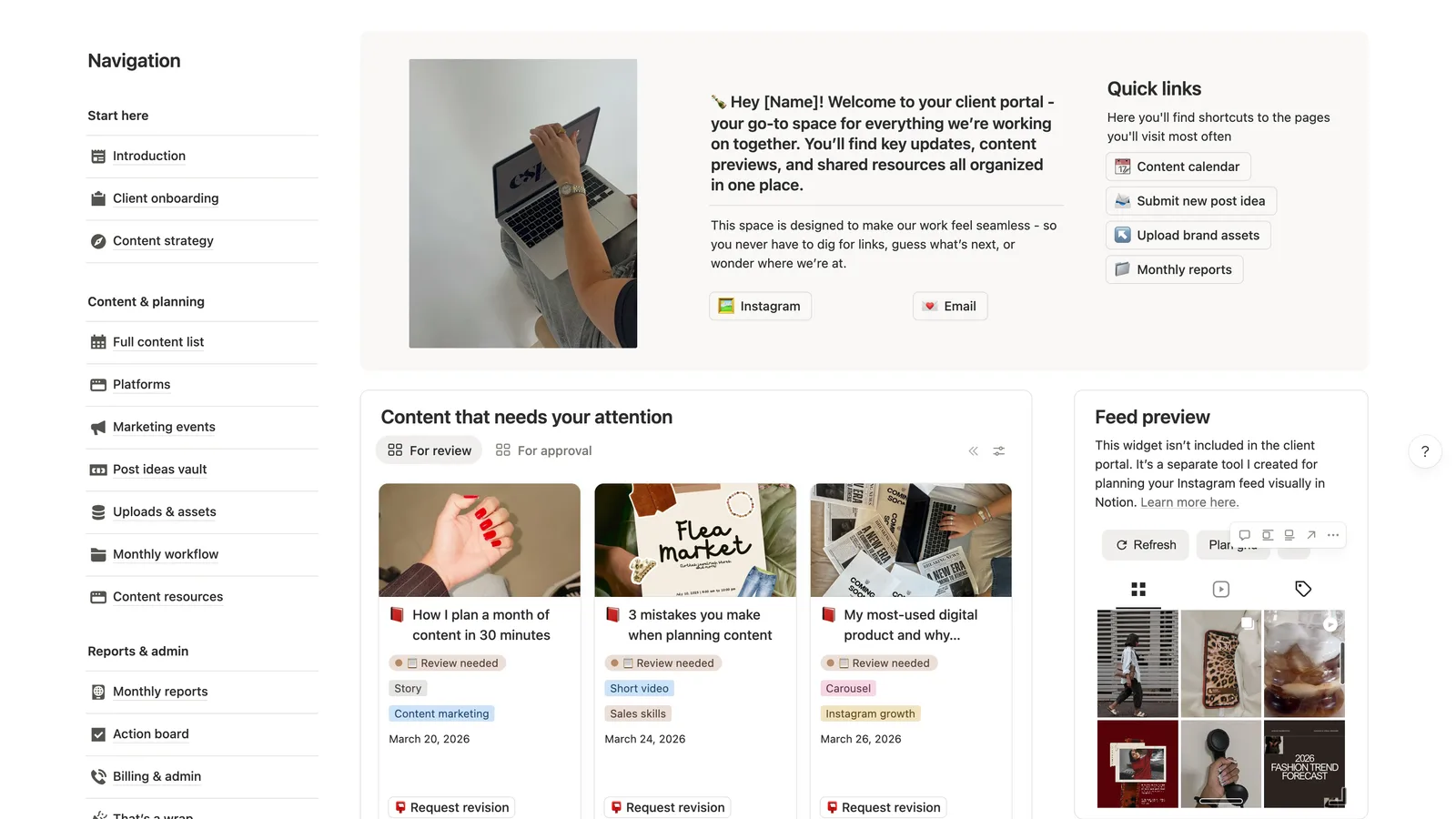
Inside the portal, each post is a card carrying:
- The actual image, so they're approving what they'll see
- The caption
- The platform and the date it's meant to go out
- A status you can both read
The client opens the queue, looks at what's marked for review, and hits approve or requests a revision right there on the card, with their note attached to that post rather than floating in a chat.
What that changes day to day is that "where are we on the March content?" stops being a question, because the answer is a page they already have open.
And what you're chasing becomes visible without asking: four approved, two untouched since Tuesday, which is a much easier message to send than a general nudge into the void.
Give the month a shape your client can see
Clients ask what's happening this month more often than they ask anything else, and it's easy to read that as checking up on you.
Usually it's simpler, because social work is invisible until it publishes, so there are long stretches where they've paid you and nothing has visibly occurred.
A monthly workflow page answers that permanently. Last month, this month, next month, each with a status and a progress bar, and underneath, a table running the full year so they can see the rhythm rather than a single snapshot.
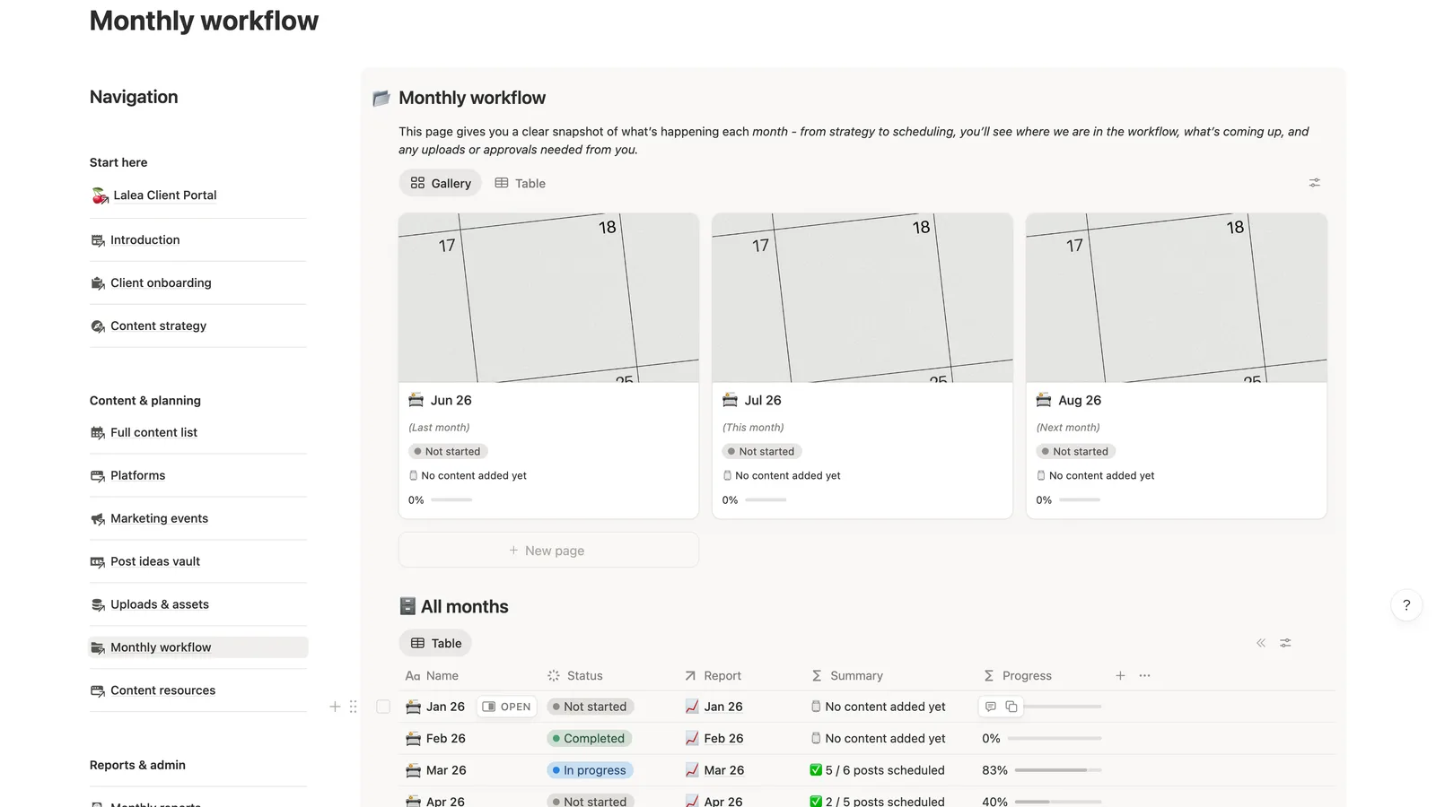
Open any single month and there's the live board of where each post has got to, plus a short note on what you're focusing on and why.
That note does more than it looks like. Two sentences on why this month leans on carousels, or why you're testing a different posting time, is the difference between a client who thinks they've bought posting and one who understands they've bought thinking, and it's the cheapest retention thing in the portal.
If you're building the actual thinking from scratch, the decisions that feed this page are the ones in a proper content strategy template, worth doing once per client and then leaving alone.
The report that answers "how did we do" before anyone asks
Reporting is where a lot of solo social media managers quietly lose clients, and usually not because the numbers were bad.
It's because the report arrives as a PDF in an email on the 4th, gets opened once, and then sits there comparable to nothing. Three months in they have three PDFs in three email threads and no sense of a trend, so when they're deciding whether to keep paying you, they're deciding on a vibe rather than on the growth you delivered.
Keeping the reports in the portal fixes that on its own, because every month sits next to every other month.
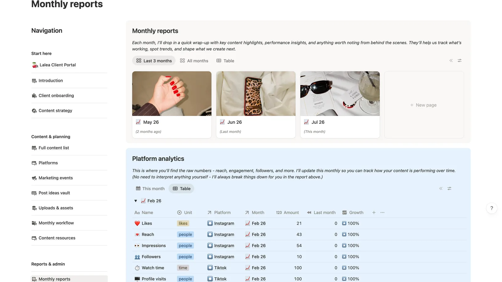
Underneath the written reports there's the raw table, reach and impressions and followers and shares, broken out by platform and month with a growth column.
Put a line under it telling them they don't need to interpret any of it, because you'll always break it down in the write-up above. That single line changes what the numbers are for.
A client staring at an analytics table with no guide will find the one metric that dipped and open with that, where a client who's been told the story first reads the table as backup for what you already explained.
Write the honest version too, including the month your reach flattened and what you're changing because of it. It reads as somebody in control of the account, where a report that's glowing every single month starts to feel like marketing at some point.
The two pages that stop you being your client's search engine
The rest of the "can you resend that?" traffic comes from two places, and both are solvable with a page each.
🧰 Content resources
This is the shared toolbox, and it exists because you're currently resending the same six things forever:
- Hashtag sets
- The hooks and calls to action that sound like them rather than like a template
- B-roll you've asked them to film
- Trending audio worth using
- Every link either of you keeps needing
- The visual references you point at
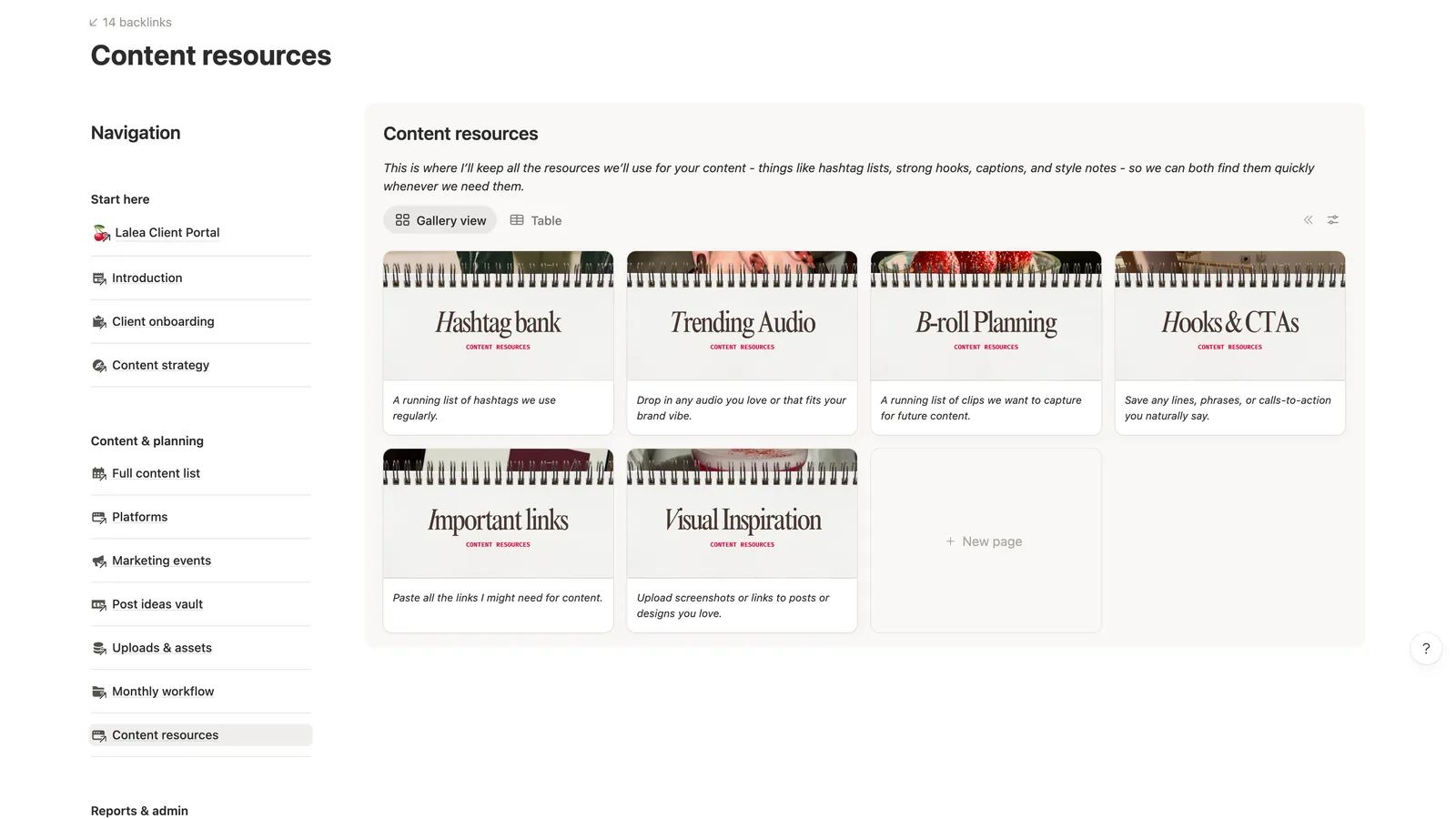
It's a boring page and it kills a genuinely annoying category of message.
💸 Billing and admin
The other half is the business side, which clients ask about at the worst possible times, usually on a Friday afternoon:
- Invoices with their status
- How to pay
- The signed contract, where they can pull it up themselves
- Call booking links
- The policies written down plainly, so late payment terms and reschedule notice aren't a conversation you have to have
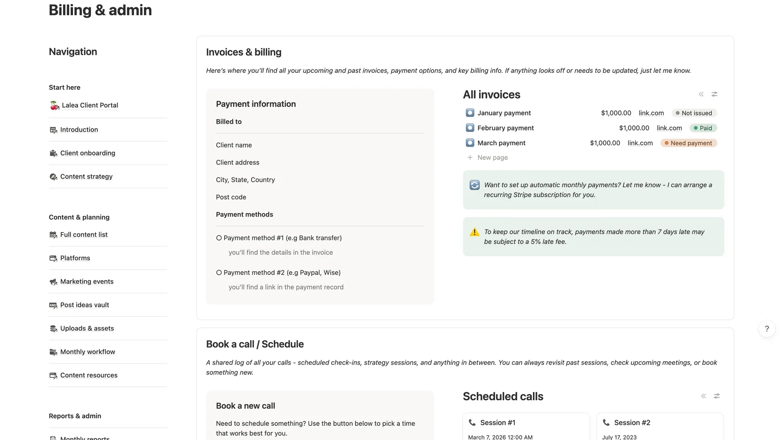
Putting your late fee on a page rather than in a message is also just easier on you, because it's already agreed and already sitting there in writing, so raising it becomes a matter of pointing at something you both signed up to.
Close it out properly, because offboarding is a page too
Almost nobody builds this page, and it's worth an hour because it lands at the one moment in the whole relationship when asking for a referral costs you nothing.
When an engagement ends, the default is that it just sort of stops. Last post goes out, you send a final invoice, and the relationship trails off without either of you ever saying what it added up to.
An offboarding page ends it on the numbers instead:
- What you made, how the account grew, follower count then and now, what performed
- A folder of everything they're taking with them, and the date it expires
- A short feedback ask, while they still feel warm about it
- A plain offer of a thank-you if they send someone your way
That last one works because you're asking right after they've read a summary of good work you did for them.
How to share a Notion client portal without exposing your whole workspace
This is the part people get nervous about, fairly, because the fear is specific: you do not want client A opening a page and finding client B's rates.
The mechanics are simpler than they look, and the safe shape is one portal per client, each a top-level page in your workspace, with nothing shared above it.
What each permission level actually does
When you invite someone to a page, Notion gives you four levels:
- Full access. They can change the page and share it onwards, which no client needs.
- Can edit. They can change content, but not reshare it.
- Can comment. They can leave comments and nothing else.
- Can view. Read only.
For a social media client, can edit is usually right, because you want them filling in onboarding forms, dropping ideas into the vault and hitting approve on posts, and all of that counts as editing.
The rule that actually matters is inheritance. Permissions flow downwards from a parent page to everything inside it, so a client invited to their portal gets every subpage automatically, and sharing a page higher up the tree hands over everything below it too.
What you invite a client to is their own portal, never the parent page that holds all of them.
What it costs, and the free plan's ten-guest ceiling
Guests don't take up paid seats, which is the part most people get wrong when they're working out whether this is affordable. A guest is someone invited to specific pages rather than your whole workspace, and they're billed differently to members.
The number that will eventually catch you out is the guest cap. Notion's free plan allows ten guests, and paid plans lift that. Ten sounds like plenty at three clients, until you remember most clients want two or three people in there.
Example: three clients with two contacts each is six guests, comfortably free. Add a fourth client with a marketing manager and an owner and you're at eight, with two left.
Build it yourself, or duplicate one that already works
Building your own is genuinely doable, and the argument for it is that you'll know every database and be able to change anything without hunting for what's driving what.
Be honest about the cost though, because the databases are the quick part. What takes the weekend is the wording on every page, deciding what the client sees against what stays yours, and the pass you do a month later when you find out which parts nobody opened.
If you'd rather skip that, the Social Media Client Portal is the version of this I built, thirteen pages covering onboarding through to offboarding, made to duplicate for each new client. It works on the free Notion plan and it's built for desktop, which is where clients review content anyway.
Every screenshot above is from it, and there's a full walkthrough on YouTube if you want to watch me click through the whole thing before deciding whether it's your kind of setup.
One honest note on those screenshots: the feed preview on the home page isn't part of the portal. That's the IG Grid Widget, a separate thing for planning a grid visually inside Notion, and it's worth knowing rather than buying the portal expecting it.
And if you want to test whether working this way suits you before spending anything, start with the free content planner and see how it feels to have the month written down somewhere that isn't your head.
Whichever way you go, build the approval page first. It's the one that gives you your week back, and everything else is easier to care about once you're not spending Tuesdays chasing a thumbs up.
Frequently asked questions
To be invited as a guest, yes, but it's a free account and takes about a minute. The alternative is publishing the page to the web, which needs no account and also has no access control, so anyone with the link can read everything on it.
Notion's free plan gives you ten guests, and paid plans raise that. Count contacts rather than companies, because most clients want at least two people in there, so ten guests is realistically four or five clients before you need to upgrade.
Not if each client gets their own top-level portal page. Notion permissions flow downwards from a parent page, so a guest invited to one portal sees that portal and nothing else in your workspace. The mistake to avoid is sharing a parent page that holds all your clients, because that hands over every portal underneath it.
Edit access is usually right for social media clients, because approving a post, filling in an onboarding form and dropping an idea into the vault are all edits. Comment-only blocks all three, so you end up transcribing their answers yourself. Avoid full access, since that lets them reshare the page onwards.
For content calendars, drafts, reports and brand assets, yes, with one caveat: Notion's access control is page-level rather than row-level unless you're on a Business plan. So anything genuinely sensitive belongs on a page the client was never invited to, rather than filtered out of a view they can see.
Nothing beyond your Notion plan, if you build it or duplicate a template into your own workspace. Guests don't take up paid seats, so the only cost that appears is upgrading past the free plan's ten-guest cap. The paid tools that put a custom domain and branded login in front of Notion are a separate subscription most solo social media managers don't need.
It opens on a phone, but portals built with wide tables and multi-column layouts are made for a laptop and don't reflow neatly on a small screen. Clients reviewing content and reading reports tend to be at a desk anyway, so design for that and let mobile be the quick-check case.